While there are good reasons why the denunciation of “fascists” has hardened into a reflex on the Left, there are also good reasons for restraining it. The relentless negativity of this fixation makes it difficult to articulate an alternative to capitalism free of fundamentalism and other reactionary discourses. Although visually all over the place, this poster takes a more positive approach, with significant implications.
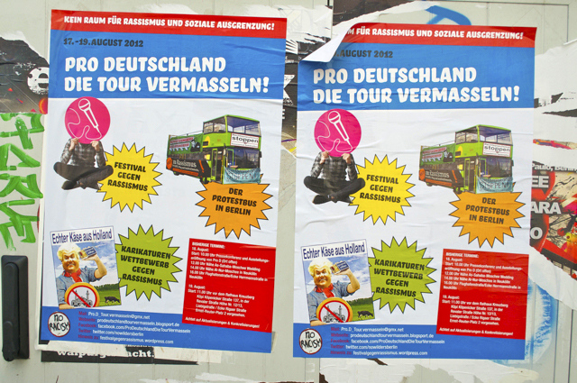
The first thing that catches the viewer’s eye is a riot of color, one that definitely exceeds most conceptions of good taste. While it’s possible to make effective use of multiple palettes, provided they balance each other out, this poster has the air of computer graphics from the late 1980s, when the excitement of finally being able to pick from a wide range of colors inspired even designers who should have known better to indulge a broad swath of possibilities.
But there’s a method to this madness. “Mess up the Pro-Germany Tour!”, the header declares, subtly implying that the poster’s outré color scheme is part of the plan. After all, in a nation where white, black, red and yellow have too often paraded in smartly coordinated designs, the liberal use of sky blue, pink, orange and olive green comes off as a repudiation of nationalistic political identification. Sure enough, a perusal of publicity materials for the immigrant-hostile Pro-Germany Party makes it clear how much mileage it seeks to get from the colors of the Federal Republic’s flag.
By contrast, the colors of this poster are all associated with attempts to break with the past those colors represent. Pink, of course, has long connoted homosexuality, most famously in the triangles the Nazis forced so-called deviants to wear. And both orange and olive green were used extensively in consumer goods of the 1970s, in the wake of the long-delayed “coming to terms with the past” provoked by the counter-culture.
The text inside the poster’s colorful splotches reinforces the sense that palettes have important political implications. “Festival Against Racism” it reads in the yellow one; “The Protest Bus in Berlin” in the orange; and “Anti-Racist Caricature Contest” in the olive green. The latter is the most telling, as it is juxtaposed to a presumed example of such a caricature to its left, featuring the slogan “Real Cheese From Holland”.
Although the message along the top of the poster proclaims “No place for racism and social marginalization!”, the overall effect of the design is not to set limits but to remove them. By providing such a clear contrast with nationalistic iconography, it suggests that leftists would be better served fashioning new places instead of trying to fence off old ones. Indeed, one could argue that the ultimate message of this anything-goes aesthetic is that the allocation of space isn’t a zero-sum affair: there’s enough Lebensraum for everyone.
Commentary and translation by Charlie Bertsch. Photograph courtesy of Joel Schalit.